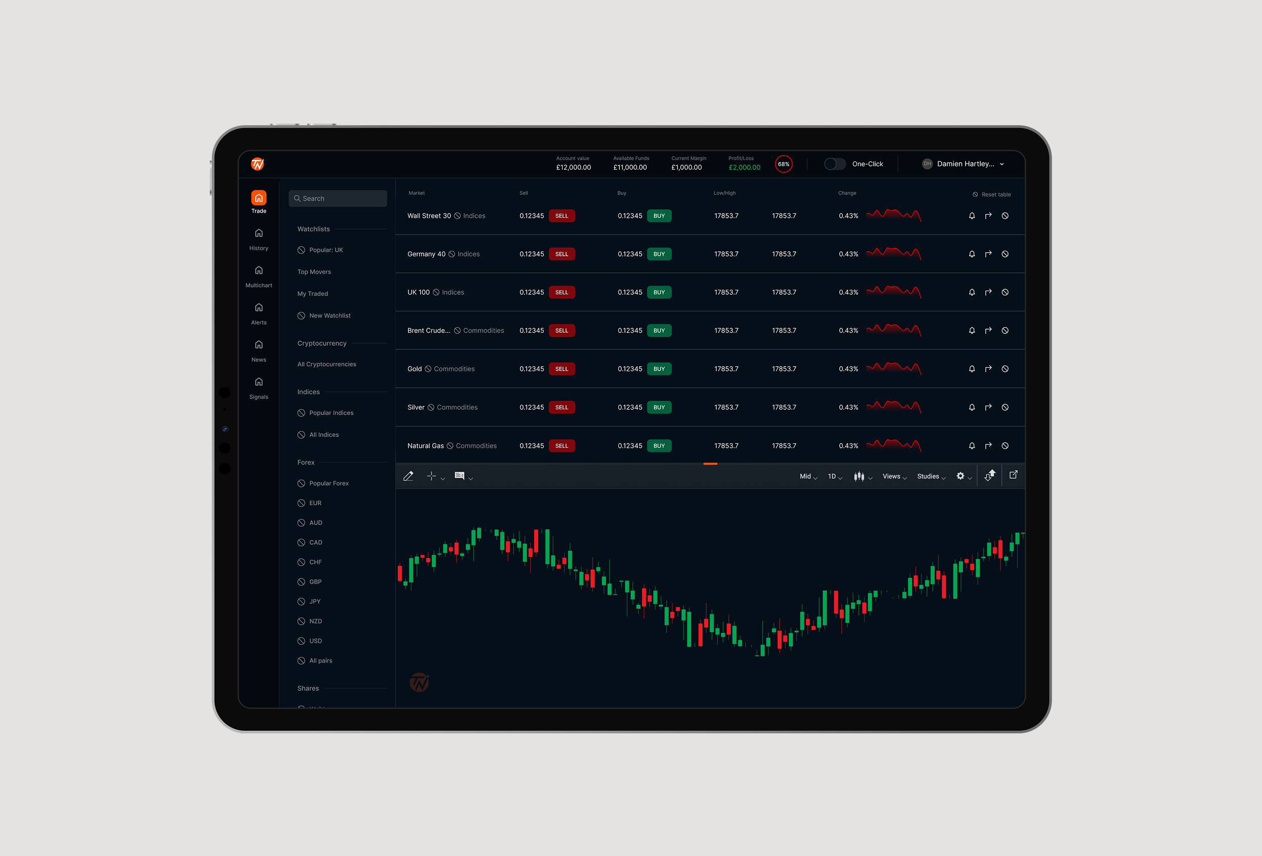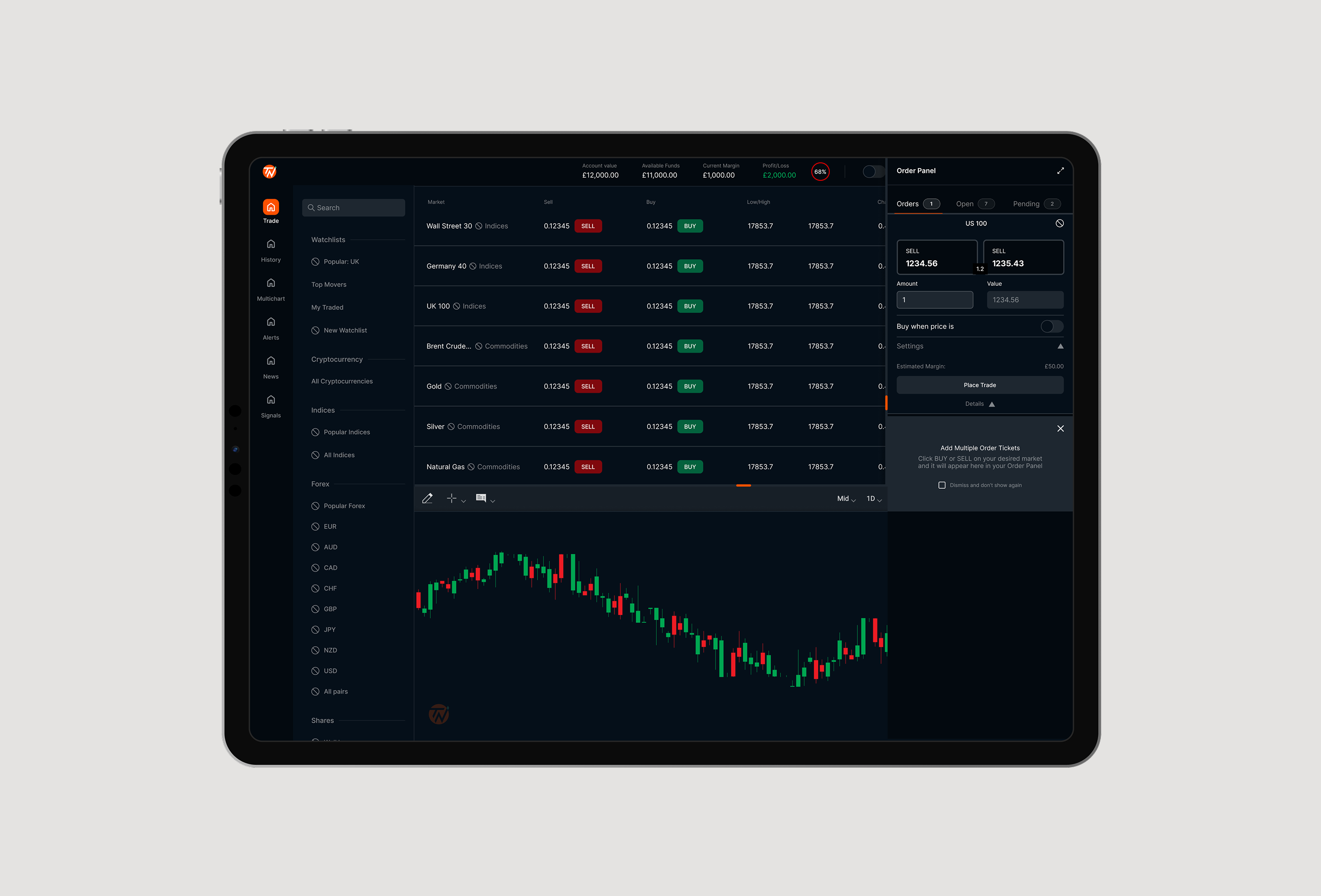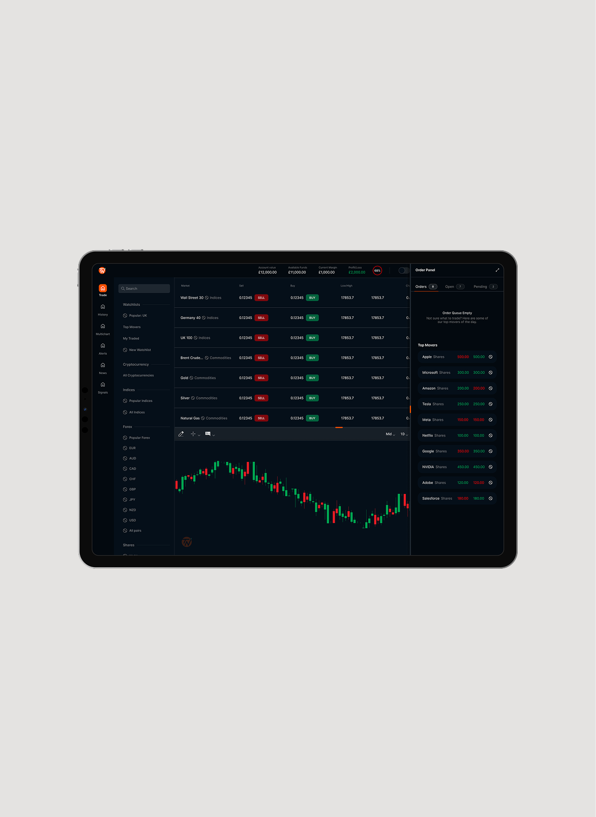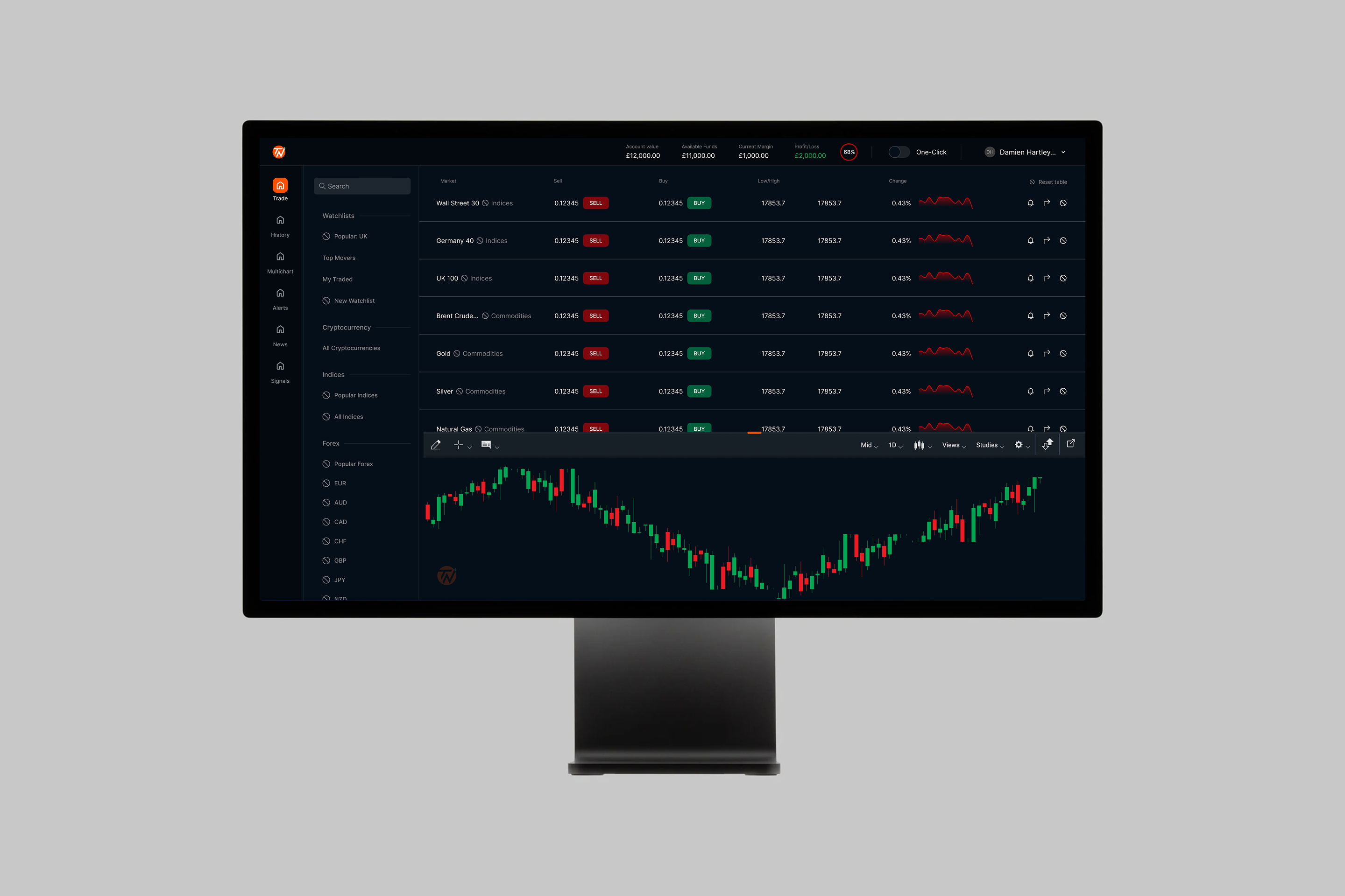
We took on the challenge of revamping a trading platform that hadn’t changed in nearly a decade. With our users front and center, we designed a modern, intuitive experience backed by a flexible design system built for scale and innovation.
SkillsUser Interface, User Experience, Product Design, Usability Testing
With marketing paused, the existing user base carries the commercial weight. Getting them onto the new platform validates the experience with real users and keeps the business performing while growth catches up.
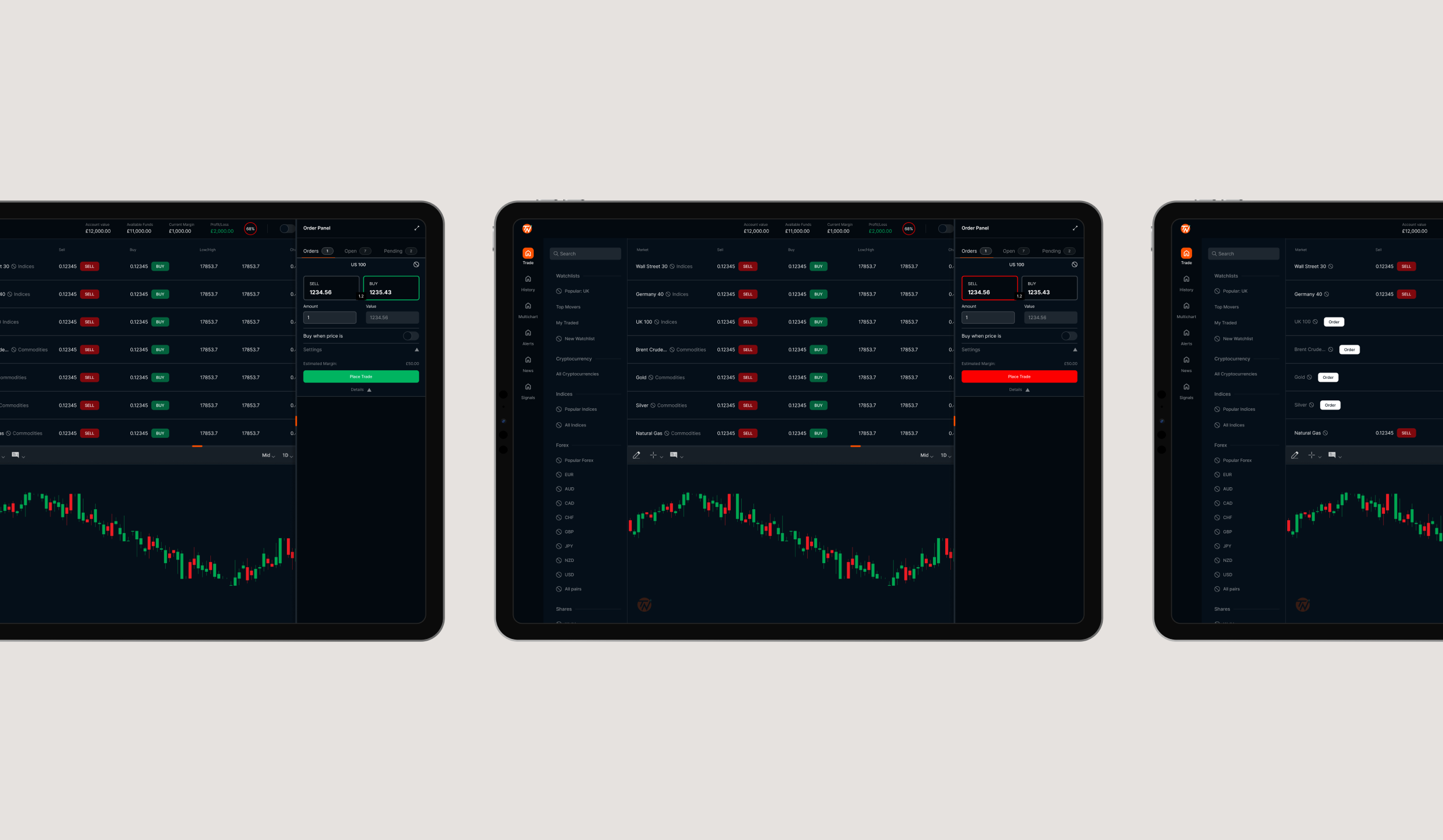
The existing codebase had reached its limits. This project was the forcing function for a full migration to React, so every design decision had to serve both today's users and a scalable component architecture going forward.
For the first time, the platform was being shaped by real user input rather than internal assumptions. Genuine customer insight gave the design process a foundation to build from.
Increase the lifetime value of existing customers by making the platform worth returning to. Designing for frequency, session depth and trade confidence: more sessions, longer visits, fewer barriers to placing a trade.
User Research
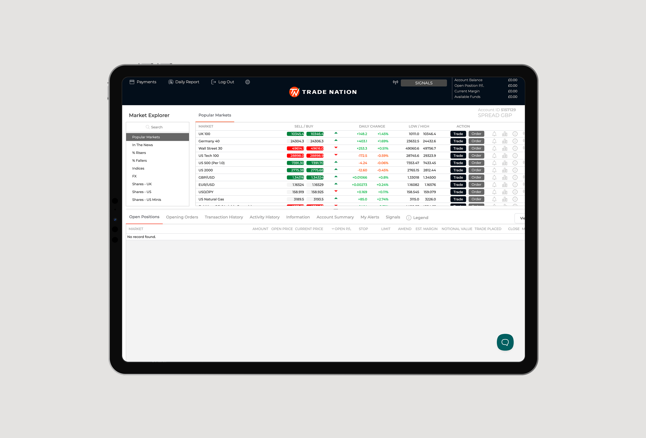
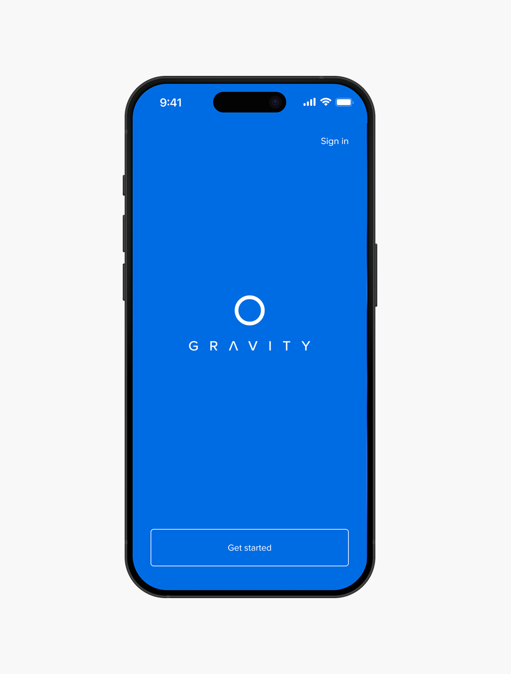
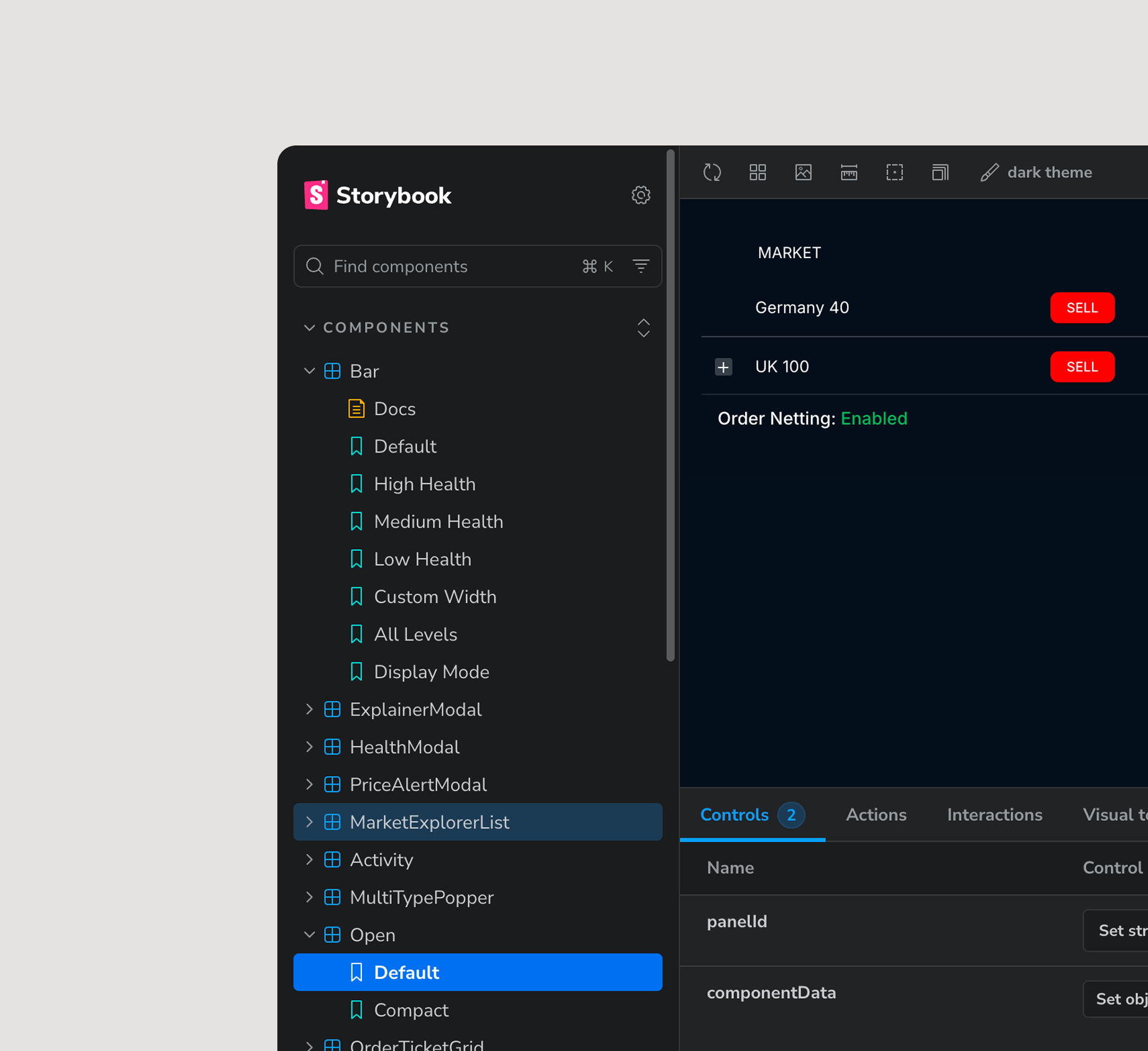
The interface hadn't kept pace with the visual conventions users had come to expect elsewhere, creating a perception of being outdated that undermined trust before a trade was ever placed.
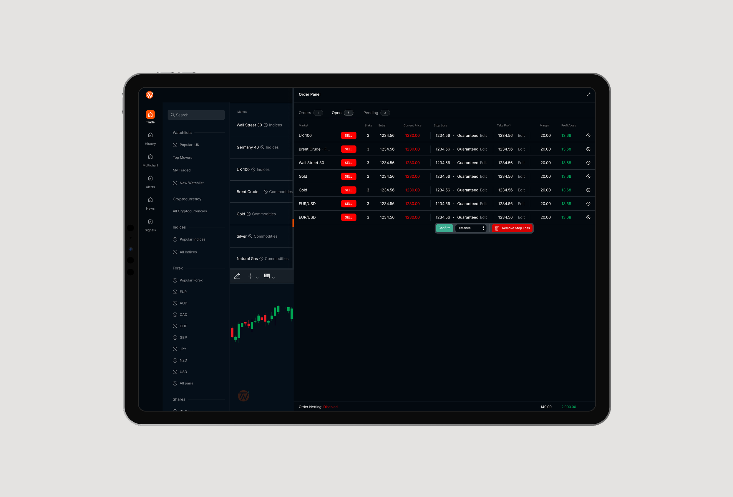
Short-timeframe traders were overwhelmed by how much information they needed to process at once, with no clear visual hierarchy to guide attention.
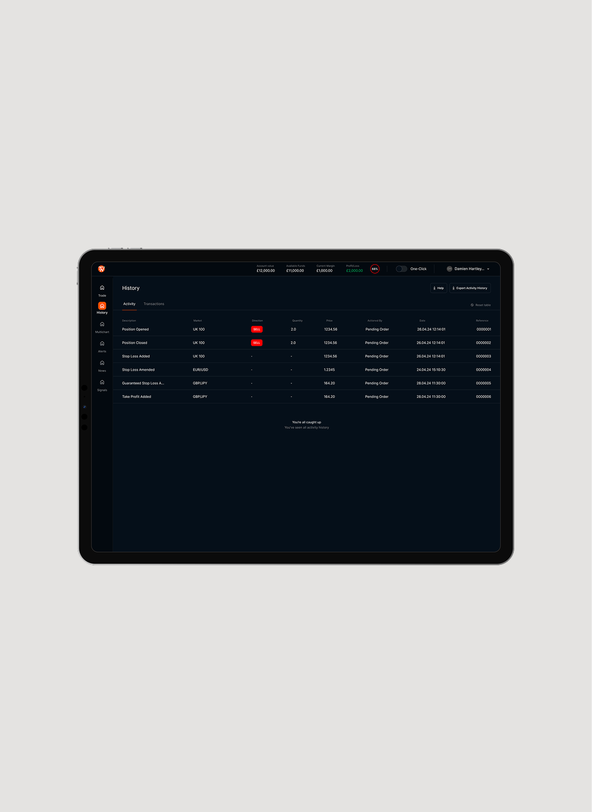
Exporting trade history and data was a cumbersome, time-consuming process. For traders who exported regularly to run their own analysis, often daily, the friction was significant and added unnecessary overhead to an already complex workflow.
As a secondary broker for many users, first impressions were being shaped by what other platforms had already normalised. Trade Nation's UI wasn't meeting those expectations, leading new users to perceive the product as less capable than it actually was.
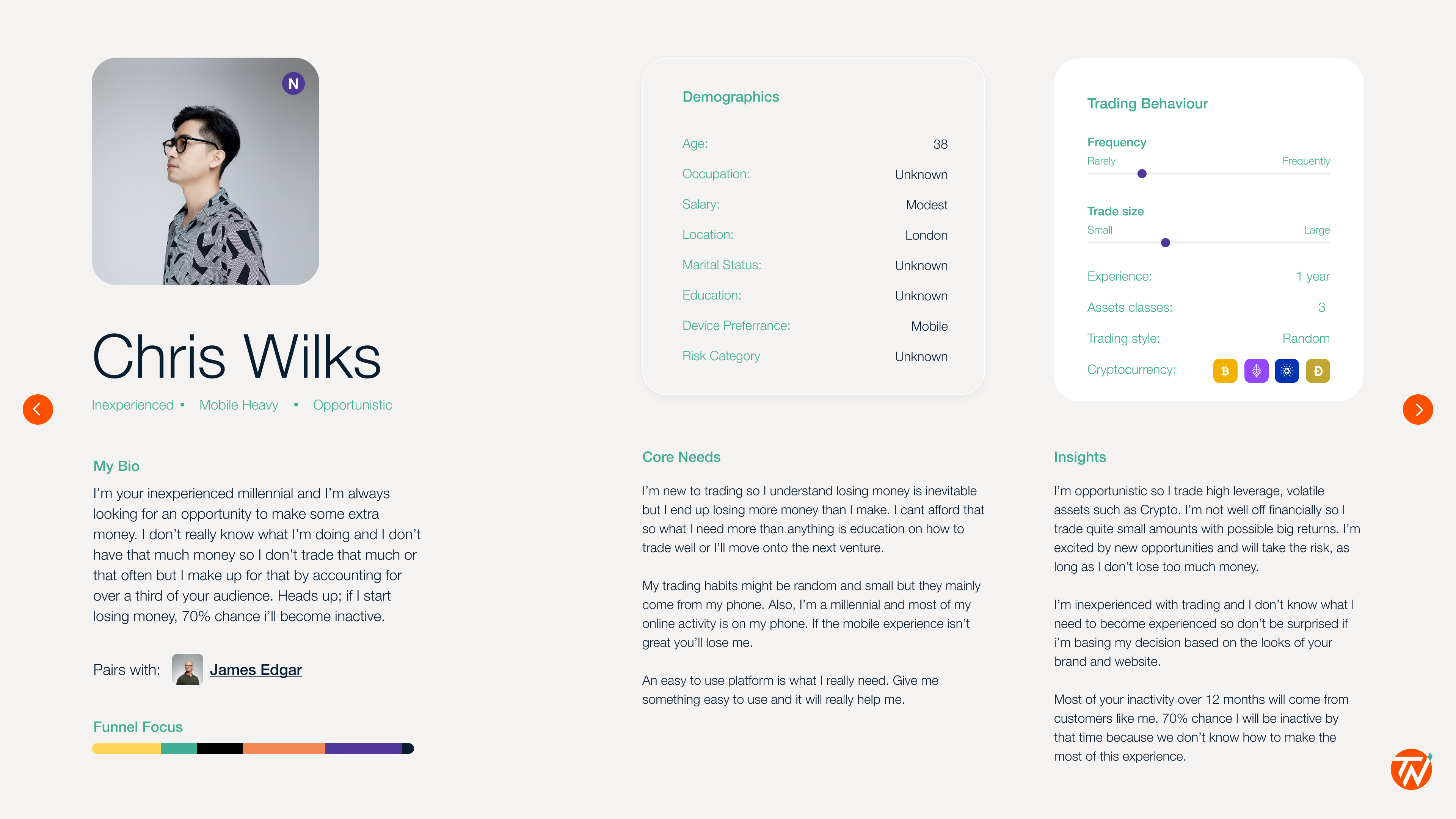
The most common user type wasn't an experienced trader but someone who had signed up with intent yet had no idea how to navigate the platform or place their first trade. The UI offered no guidance for the journey that mattered most.
An alerts system that only notified users via email had become completely redundant. Email open rates sat at around 4% and were almost always read after the market had already moved, making the feature effectively useless for a product where timing is everything.
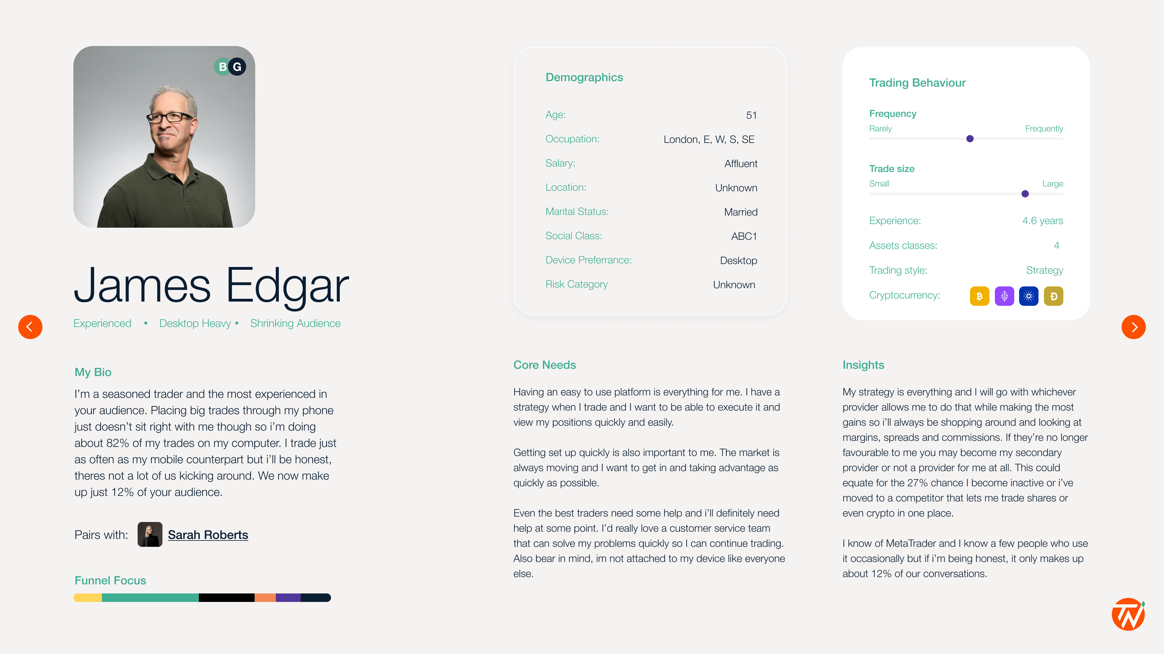
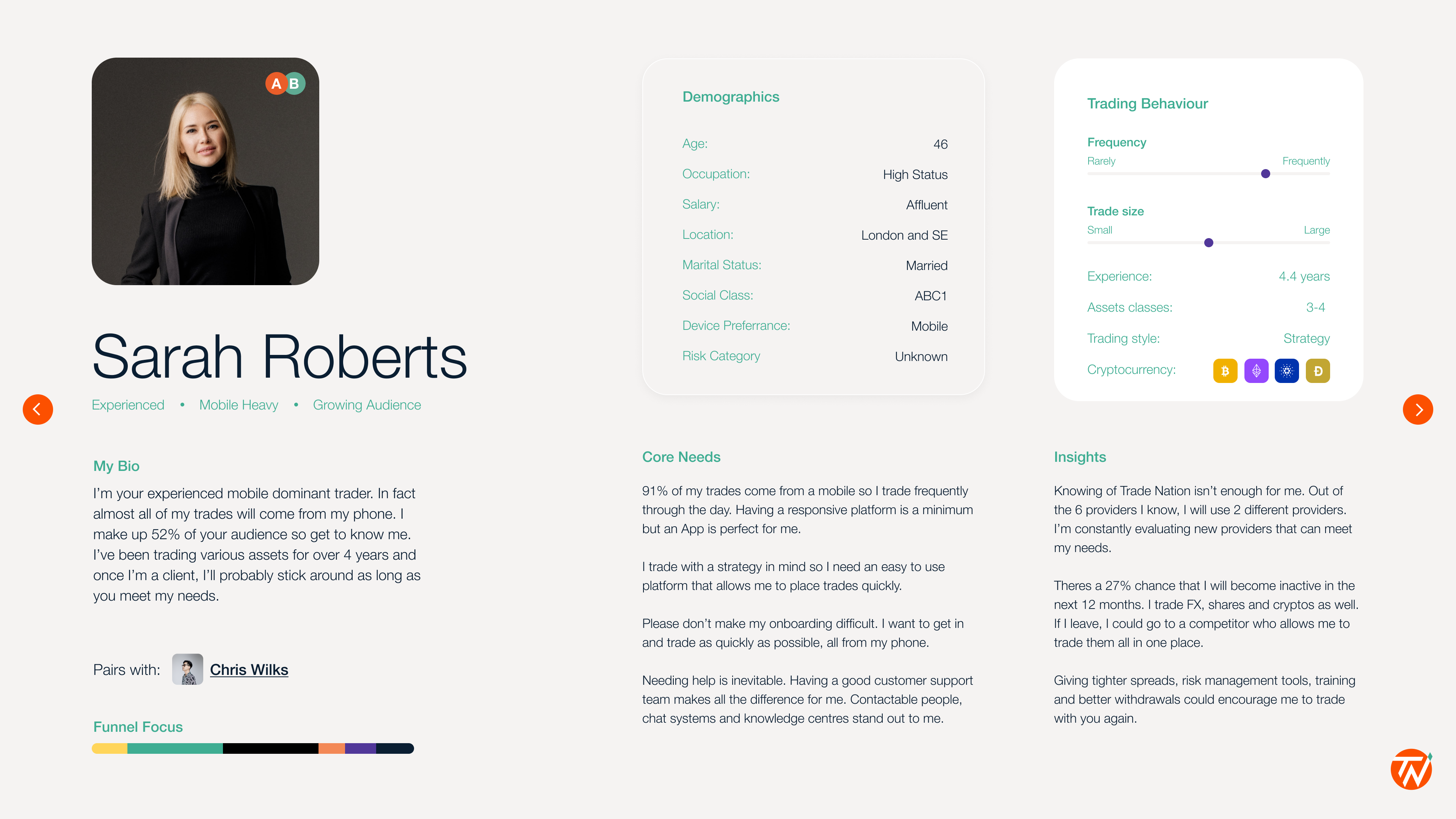
The product needed to meet the needs of our three different personas simultaneously, without alienating. The nuance is that 2 of the 3 personas (James and Sarah) are who we ideally want as clients but the remaining persona (Chris) is who we actually attract the most meaning the solutions and layouts have to be in line with the growth of our target audience, without the disrupting the experience of our most dominant trader group.
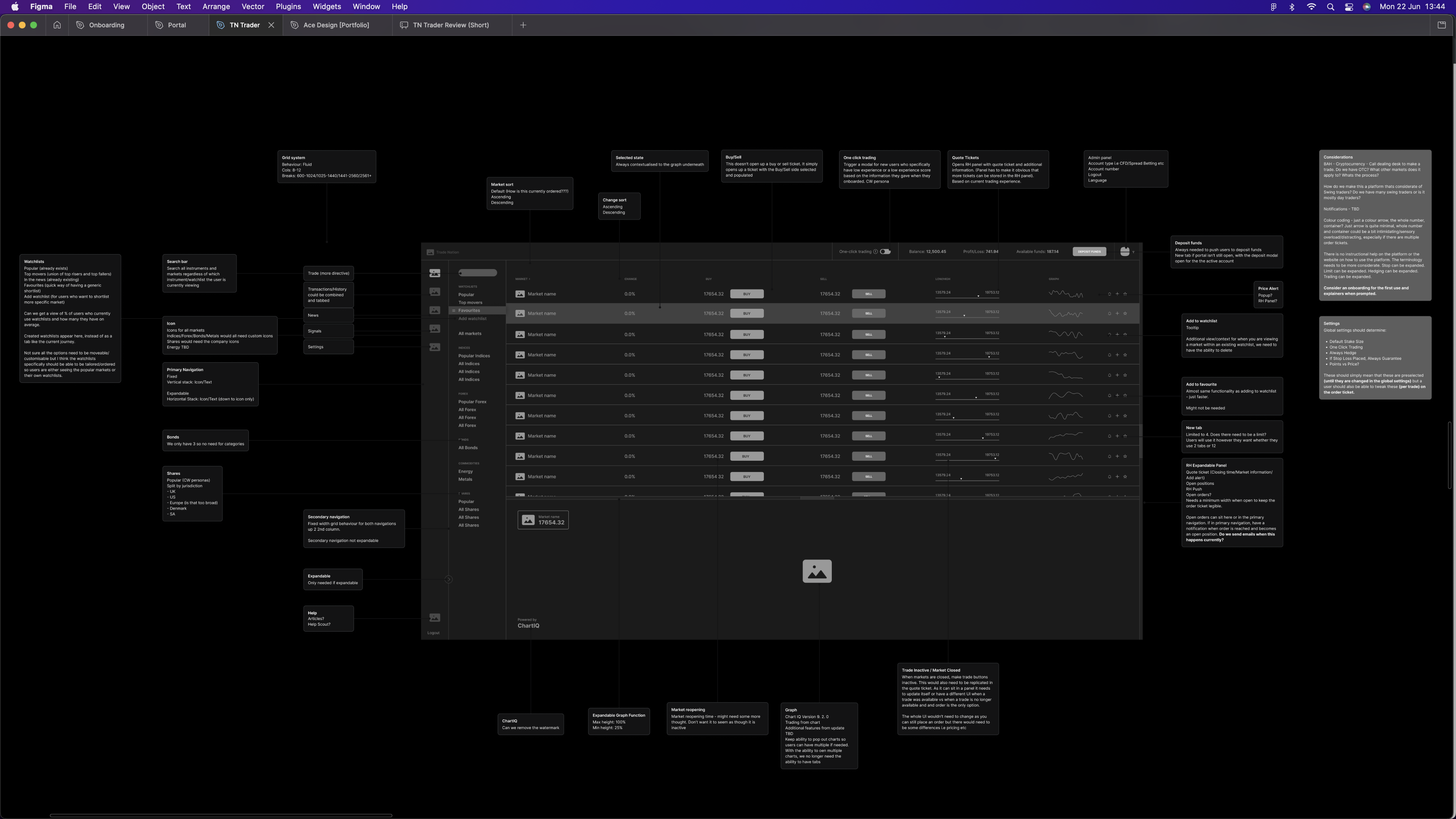
The layout needed to change not just visually, but structurally. Competitive analysis placed us in the market and informed a new platform architecture, one that gave inexperienced traders an intuitive entry point without stripping back the depth our experienced users relied on. From there, we built out a detailed breakdown of how the platform could come together technically to get stakeholder buy-in.
+46%
Beta adoption
+17%
Platform revisits
+23%
Placed trades
+£7M
Monthly trade volume